Amontillado: Designing the Book Cover

This was originally posted at the Amontillado Novel blog, but I’m adding it here for safekeeping.
Let me just say it: I love the Amontillado book cover. For a long while, I didn’t think those words would escape my fingertips. Not for lack of effort. Not for lack of good ideas. I had simply ventured down too many dead ends to think I’d ever arrive at anything I could love. I was wrong.
Let me also say this: it couldn’t have happened without help. While I can doctor up a striking color gradient in Photoshop, I’m not graphically inclined enough to produce anything of true merit, so I must seek out those with skills I envy.
Thus, two rather talented gentlemen found themselves routinely pestered over an 18 month period to mock up my ideas. Mr. Brian P Dean (I can’t find his website, so here he is on IMDB), post-productionist / videographer / lighting specialist / sculptor / artist extraordinaire. And Mr. Erik Gloor (http://interfacemason.typepad.com/), UI designer / videographer / animator / artist guru.
They’ll probably be afraid of what I’m about to show, because it was all done quickly as a means of experimentation. No worries, gentlemen, for I’ll provide the disclaimer.
So let’s see how it all went down.
Amontillado, the beverage, is a type of sherry aged in large barrels called casks (hence the title of Poe’s short story). Initially I saw the book cover as a label similar to what one might find on a sherry bottle. Mr. Dean, after having read the screenplay (yes, Amontillado was initially drafted as a screenplay), spent an evening mocking up some ideas. Early fans of the Amontillado Facebook page may remember one of these as the page’s profile photo.
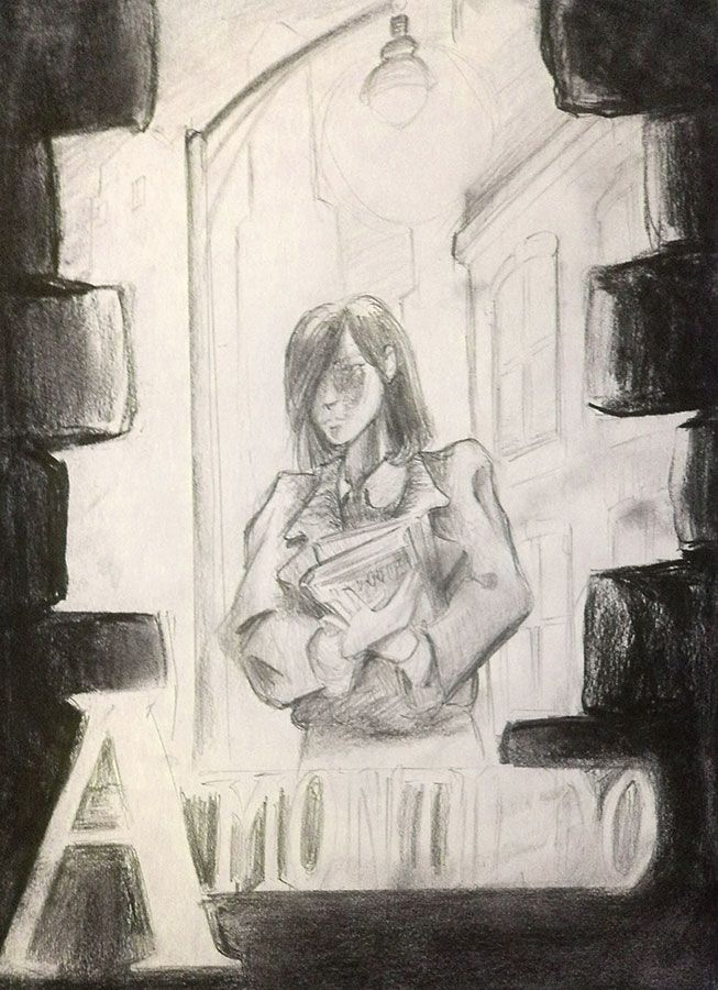
Eventually, I found the label idea too limited, so we switched gears. Mr. Gloor and I brainstormed a bit over beers one night in Chicago. I, of course, had preconceived desires for the tone and style of the cover. The story of Amontillado began with the conception of a single scene: Jacob and McComber meeting beneath a streetlamp. I wanted that scene represented. Erik listened politely, no doubt thinking me insane, eccentric, and laughably unrealistic. But when he returned a week later with sketches, I was thoroughly impressed. He came up with the idea of allowing us (the viewers) to witness the scene from behind a wall, as though we’re being buried behind it. It was a great idea given the events of the novel, and it worked well.
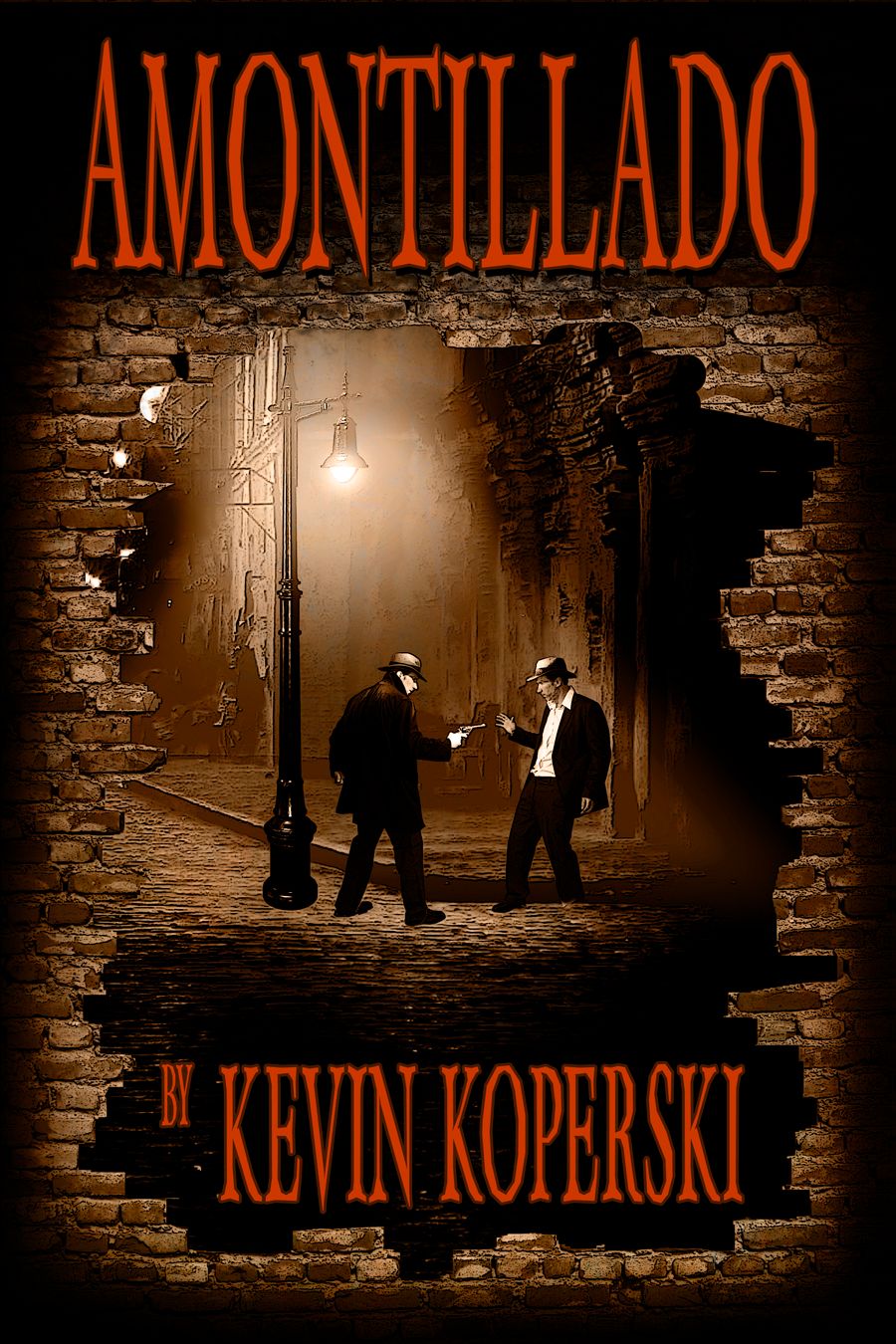
Meanwhile, I mentioned the wall concept to Mr. Dean, and he spent another evening alone with a green screen, a camera, and photoshop to create some new mockups.
The result is pictured below. It screams book cover. My favorite part, obviously, is the fact that Brian Dean is shooting himself under a streetlamp (yes, he played both parts himself). As someone who has directed short films starring Mr. Dean, let me just say he looks great on camera whenever he’s wearing a rimmed hat (tip: ask him how he eats his pizza; you’ll get a laugh. And when he’s concentrating, shout “Me! Who? Who?” You’ll get another laugh.). Anyway, this quick mockup looked great, but again, I was after something different.
Amontillado takes place in a nameless city, during a timeless period of modernity. How can something be timelessly modern? I have no idea. The concept drives some readers nuts, but I love the surreal feel created by detaching the story from specific times and locations. I wanted the cover to convey that timeless, faceless, nameless city, but I had no idea how to achieve such a thing in a medium with which I had very few skills.
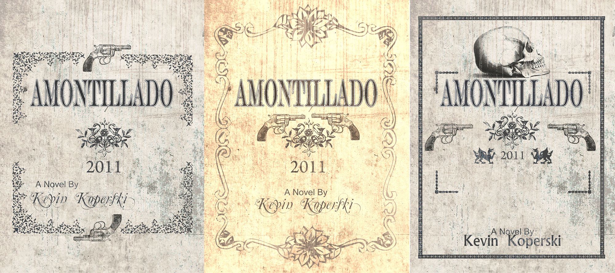
My answer was to spend an entire Saturday scouring Google Images. I planned to experiment, to formulate an idea, and to iterate through it. I wanted stylish, noirish, surreality, but I didn’t know where to start.. I thought perhaps I could flush out a concept to more clearly illustrate a style to the artists. These are some of the key iterations:
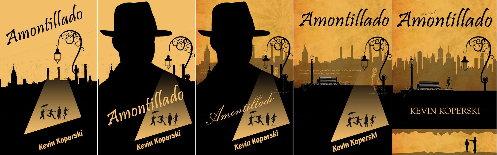
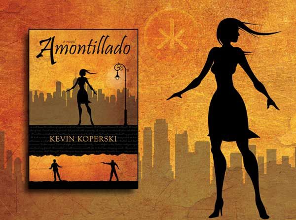
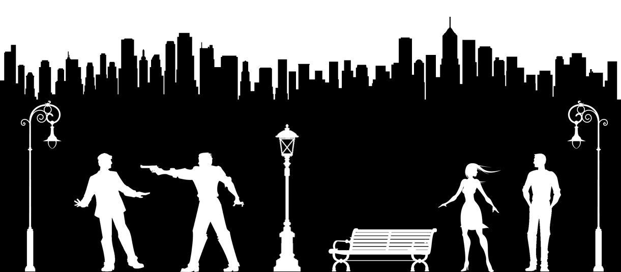
By that last iteration, I knew I was onto something. I had Bree alone (literally, though her solitude is more figurative in the story), a park bench, street lamps, and Marcus confronting Jacob in the tunnels under the city. Best of all, there were very few tangible details to give away time or location. It was all shadows and light. Dark, noirish, mysterious, and perfect. I sent the concept to Mr. Gloor and asked him to create the images I would need. Characters, lamps, bench, cityscape, etc.. He came through magnificently, producing the images below.
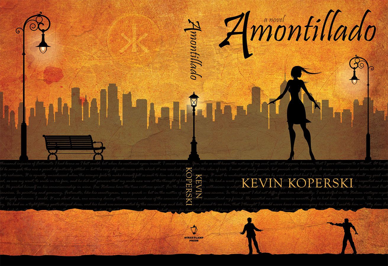
All I had to do then was create a textured background and settle on the composition. I played with many iterations, some with all three characters the same size, some with Bree much larger, others with the bench on the front cover. Within a week, I arrived at what would became the dust jacket. A slightly modified version will grace the paperback in the coming months. Here it is:
And that’s the story of the Amontillado book cover. As with any creative endeavor, you try various ideas until you discover one you like, then you iterate until you’re satisfied. Thankfully, with the help of Mr. Dean and Mr. Gloor, I came away with something much greater than simple satisfaction, and I wanted both of these gentlemen to get some acknowledgement for a job well done.
Thanks for reading! – Kevin
Also published on Medium.